
The Product Page Checklist That Lifts E-commerce Conversion
The images, proof, delivery details and mobile layout choices that help shoppers decide with confidence.
Quick answer
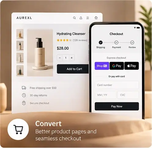
A high-converting product page answers a shopper’s questions before they ask: what it is, whether it fits, what others think, delivery cost and returns. Clear images, visible reviews and a sticky mobile add-to-cart button do most of the work.
Key takeaways
- Show delivery cost and timing on the product page, not only at checkout.
- Place genuine reviews and ratings near the price and add-to-cart button.
- Keep the add-to-cart action visible on mobile while shoppers scroll.
What should every product page include?
Use this list as a baseline audit.
- Several high-quality images, including scale and in-use shots
- A benefit-led summary above the fold
- Price, delivery estimate and returns policy near the button
- Genuine customer reviews with ratings
- Size, fit or compatibility guidance where relevant
How does mobile layout affect conversion?
Most store traffic is mobile. Keep the main image, price and add-to-cart button on the first screen, use a sticky button on long pages and make variant selectors easy to tap.
How do you test product page changes?
Change one meaningful element at a time, such as image order or delivery messaging, and compare add-to-cart and purchase rates over a full sales cycle to avoid seasonal distortion.

Follow AUREXL